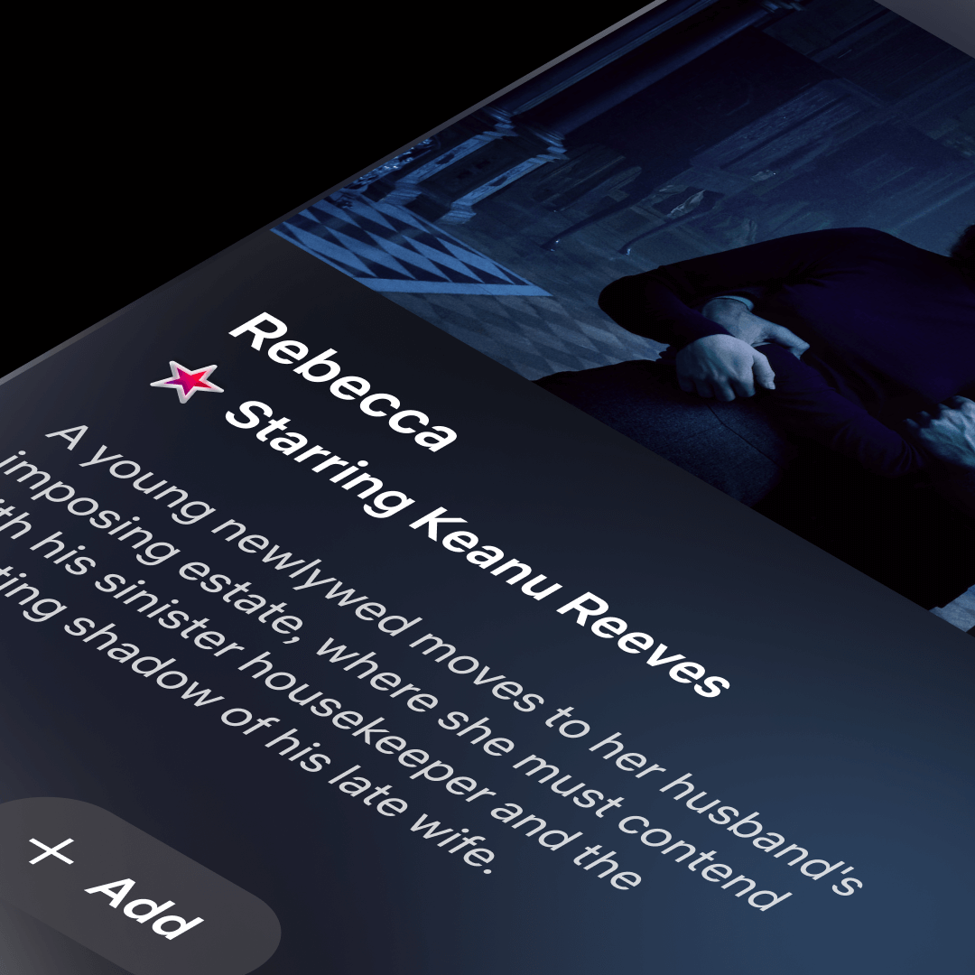
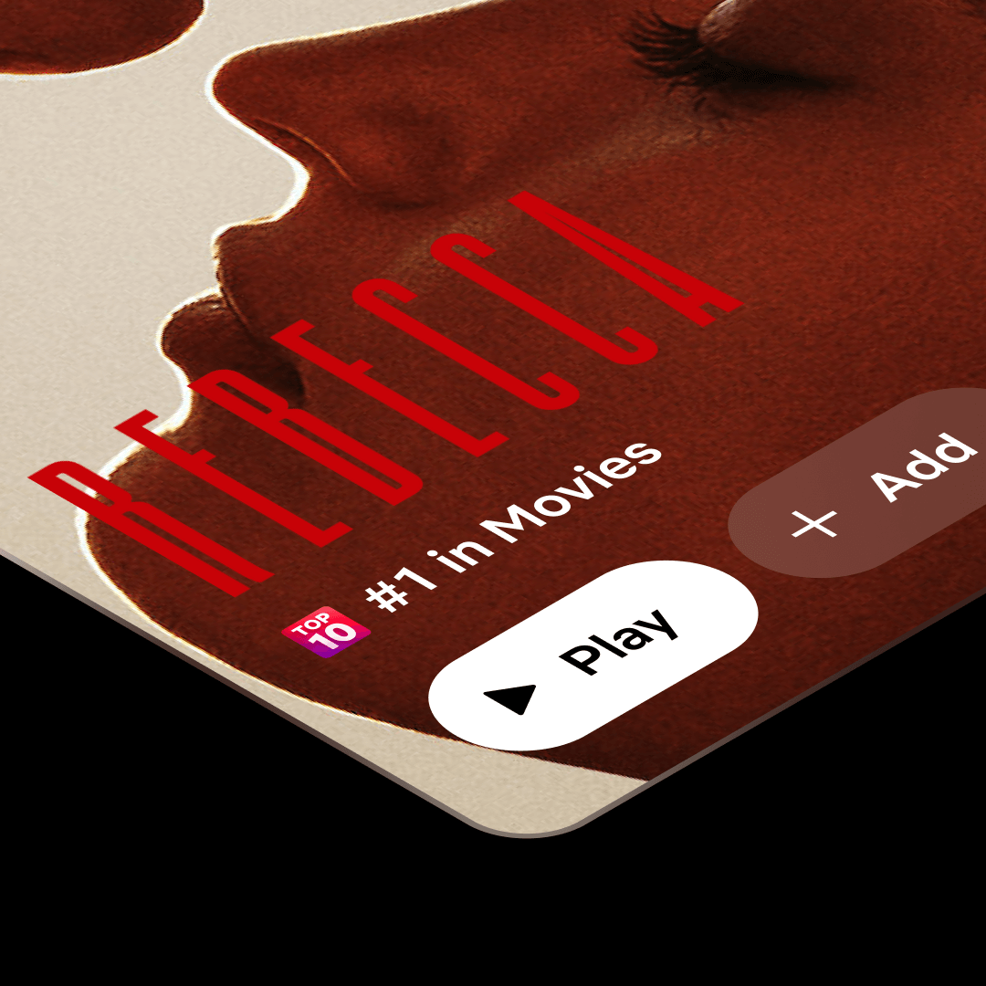
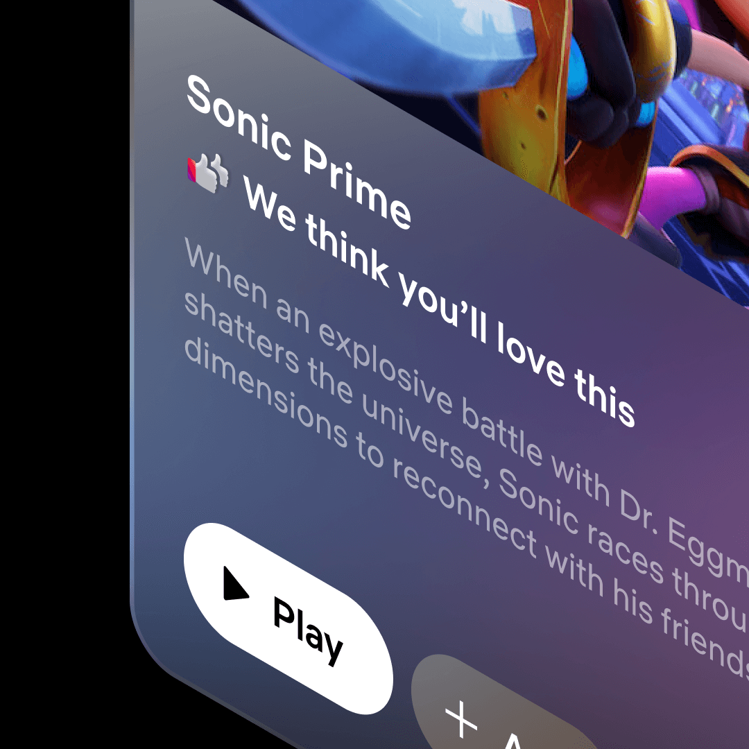
Netflix Icon System
As Netflix prepared to launch its Eclipse TV interface, they came to Oddfellows with the need for a new icon system. I directed a batch of illustrative icons, designed to drive user choice and eliminate choice-fatigue. These small visual cues needed to attract attention but reduce cognitive load, not add to it. The solution required a cohesive visual system designed intentionally for an 18px footprint and eye-grabbing from across the room. These expressive yet utility-driven illustrations that could cut through visual noise, read clearly from your couch, and help users decide faster.
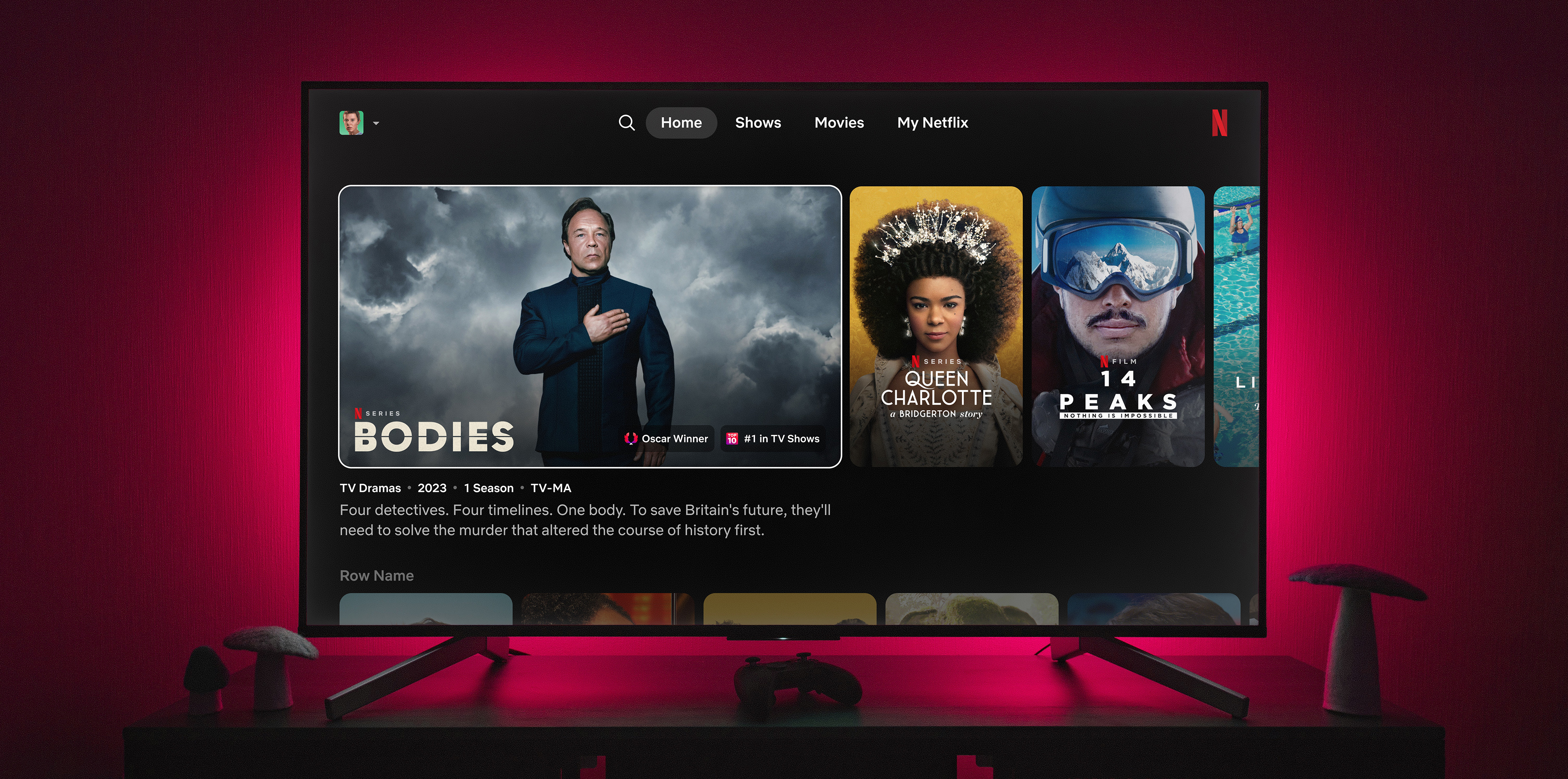


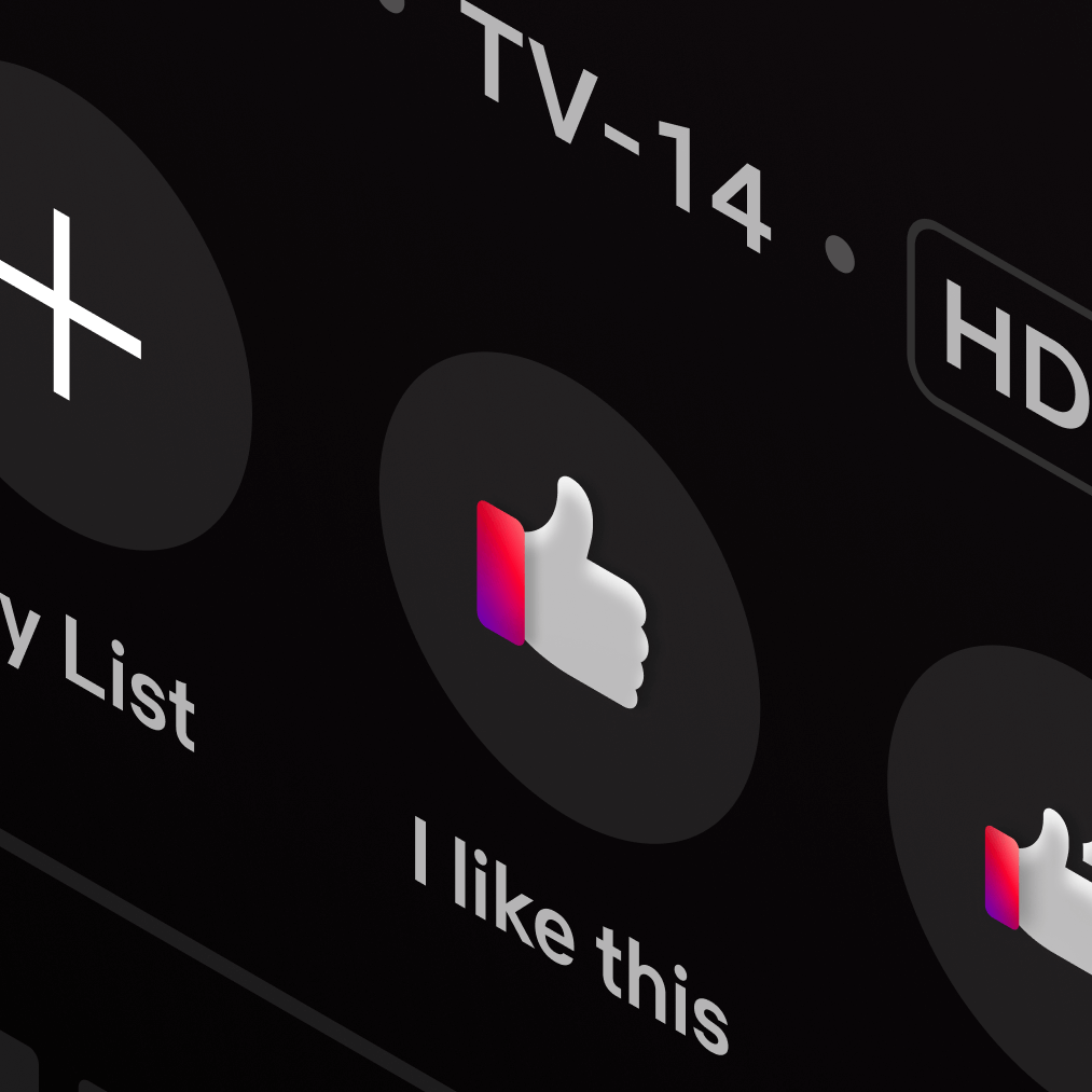
We explored five stylistic directions before landing on a system called "Jewels of Delight." Inspired by the Netflix Streams and cinematic design cues like soft lighting, layered transparency and brand-forward color, the final direction balances visual richness with functional precision. Each icon holds its own alongside photography, typography, and motion—guiding choice without adding noise. The resulting set of 20+ illustrations enhances scannability, speeds decision-making, and drives choice toward the viewing experience.